Wish you could widen the sidebar to make way for your newly acquired widget? Or want to increase the post area width to reduce the post area length? Or you wake up one morning and wonder, can I use the empty spaces on the left and right side of my blog?
Well, stop asking, and start reading, for I am going to tell you how to change the width of your blog.
But before we dive in I want to explain a little bit about what constitutes a basic layout.

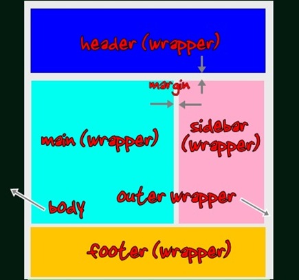
Look at the diagram above and think boxes. Yup, think of the sections as boxes, with specific widths and expandable length.
The biggest box in a layout is outer-wrapper. Inside outer-wrapper are smaller boxes, and inside these smaller boxes lie the elements. The relationships:
- header-wrapper –contains header, with header picture etc.
- main-wrapper –contains main section. Inside main we have blog posts.
- sidebar-wrappers –contains sidebars, with widgets etc.
- footer-wrapper –contains footer.
To increase the width of a box, you have make sure whether the outer box can accommodate the increase. Otherwise you have to increase the outer box width too.
Now that you understand the concept, let’s go to where the action is, in the CSS (Cascading Style Sheet) section of your template code. What you will find is usually like this:
04
| border:1px solid $bordercolor;
|
06
| ------------------------------
|
13
| ------------------------------
|
18
| ------------------------------
|
23
| ------------------------------
|
Let’s say for example you want to increase your blog post (main-wrapper) width by 100px and the sidebar by 50px. Below are the steps you need to take to ensure a success.
- Change the width of main-wrapper from 410px to (410+100)px = 510px.
- Do the same for sidebar, except adding only 50px. The new sidebar width should be 270px.
- Ask yourself what is the outer box for main-wrapper and sidebar? Looking at the diagram, the answer is of course outer-wrapper.
- Increase the width of outer-wrapper by the total amount. So you should add (100+50)px to 660px. The new width is 810px.
- That’s it!
Expected questions, issues:
- What happens if I forget to increase the outer-wrapper width? Your main section will push the sidebar to the bottom (below main section).
- How about margin, padding and border? Another analogy, if you were to gift-wrap the sidebar box, then the width is the width of the box measured from the outside, padding is (the thickness of) the box wall, border is (the thickness of) the wrapping paper and margin is a distance to other boxes’ wall. So essentially you have to take all these properties into consideration if you make major changes in your layout dimensions. But if you are only changing the width, you can disregard them.
- Background image problem -some templates use images as borders. Rounders series use background images to simulate rounded corners. These image widths are fixed, it won’t change with your blog width. If you want to keep the rounded corners, you have to download the images, edit, upload into a web host and relink them. Or you can simply remove the them by deleting their links in your template.
Labels: Blogger Templates


0 Comments:
Post a Comment
Subscribe to Post Comments [Atom]
<< Home